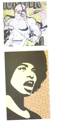
I love the smudged effect of this Dry Point print, like lino I have created a range of dry points experimenting with ink and a range of materials - here i left quite a lot of ink on the image and used very wet paper.
Tuesday, 8 February 2011
My Lino Print
Here is one of my lino prints, I personally feel this process gives a great effect and frame around the image, to expand my practice, I printed on a range of materials and experimented with ink and soaking the medium in water. I am pleased with the overall outcomes.
Development
After doing my screen print on paper I developed further to print on calico and then to use flock and foil. I really enjoyed these processes and continued a similar use of colour.
My screen print
Here is my screen print - the image was created on the screen through exposure photomechanically. I have used a light blue to keep the link between the identification of weather and colour.
Dry Point
Dry point is an engraving method in which the design is scratched directly onto a plastic surface. Dry point highlights a scratchy characteristic and is achieved by rubbing ink into the scratched lines and rubbing away the excess.
Lino Print
Linocut is similar to woodcut, however as lino is an easier surface in which to carve, linocuts offer greater precision and a greater variety of effects. The lin ocut came into its own after artists like Picasso and Matisse began to work with this technique.
screen printing
This process involves a mesh screen, mounted on a frame. An image is produced either through photomechanically or using a stencil. Printing can be done on paper/fabric by placing under the screen and applying ink. The ink is forced through the mesh with a squeegee.
analogous colour schemes use colours that are next to each other on the wheel. (for example: light blue, dark green and light green)
a triadic colour scheme uses colours that are evenly spaced around the colour wheel (for example: purple, orange and green)
the split complementary colour scheme is a variation of complementary colours adding to the base colour, it uses the two colours adjacent to its complement
the square and rectangle colour schemes use four colours arranged into two complementary pairs, the difference being the square uses colours evenly spread around the wheel
Colour Theory
colours affect us in numerous ways, both mentally and phsyically. Colours must be used consciously in my work to obtain the effect i want to achieve.
Primary colours are red, blue and yellow: you can create secondary colours by mixing two primaries, making, purple, green and orange.
WARM colours are vivid and energenic (red, orange and yellow)
COLD colours give an impression of calm (blue/green)
colours that are opposite on the colour wheel are considered to be complementary colours (for example: red and green)
Subscribe to:
Comments (Atom)


